9to5mac’s Guilherme Rambo managed to obtain screenshots of iOS 13. While it still looks like iOS, there’s a twist — there will be a system-wide dark mode to make your apps look better at night. Apple is expected to announce the new version of iOS at its WWDC keynote on Monday.
With iOS 13, users can enable dark mode in the Settings app or with a toggle in Control Center — you may have to add the Control Center button in the Settings app first.
And here’s what it’ll look like according to 9to5mac’s screenshots:

As you can see, the home screen doesn’t change much except the dock at the bottom. But the Music app looks completely different with white text on top of a black background. The tab bar at the bottom also switches from transparent white to transparent black. Apple still uses red for buttons and links, which makes the app slightly less readable.
Enabling dark mode also affects user interface elements at the operating system level. When you take a screenshot and tap on the screenshot thumbnail, top and bottom menus are dark for instance. Developers should be able to support dark mode in third-party apps as well.
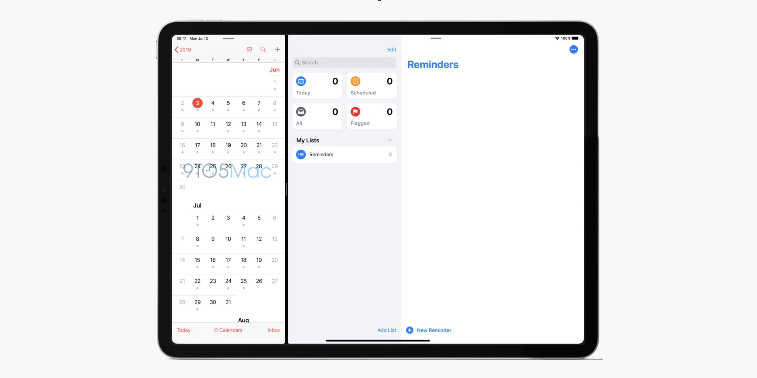
In other news, Rambo also shares a screenshot of the new version of the Reminders app. It now features four different menus — today, scheduled, all and flagged. The user interface has been refreshed as well.

Finally, 9to5mac also confirms a previous scoop with the icon of a new app called “Find My”. Apple plans to merge Find My Friends and Find My iPhone into a single app on both the iPhone and iPad.
Rumor has it that there will be more fundamental changes with iOS 13. Apple plans to let you open multiple windows of the same app. This way, users will be able to work on multiple documents or see multiple conversations at the same time. This will be a key new feature for iPad users in particular.
You can also expect smaller updates to Safari, Mail, font management, the volume indicator, the keyboard, etc.
from Apple – TechCrunch https://tcrn.ch/2JJvaed
Comments
Post a Comment