Seems like iOS gets all the love these days. And it’s easy enough to see why. The smartphone has long been the dominant device in many users’ lives, while the desktop/laptop category has been on the decline. But macOS still has some life left in it yet.
A year after introducing the more incremental High Sierra (it’s right there in the name), Apple has returned with a macOS update that’s jam-packed with new features. Unlike other recent updates, a number of the big additions here are targeted at creative professionals, as Apple refocuses its efforts on the user base that has long been a core part of its target market. In the case of features like Dark Mode and Gallery View, there’s a lot to like on that front, as well.
For the first time iOS apps have been directly ported to macOS in an effort to kickstart cross-platform development, while Stacks should go a ways toward helping users stay a bit more organized — and sane. Now that the operating system is in public beta, here’s a rundown of the biggest and best new features Mojave has to offer.
Dark mode
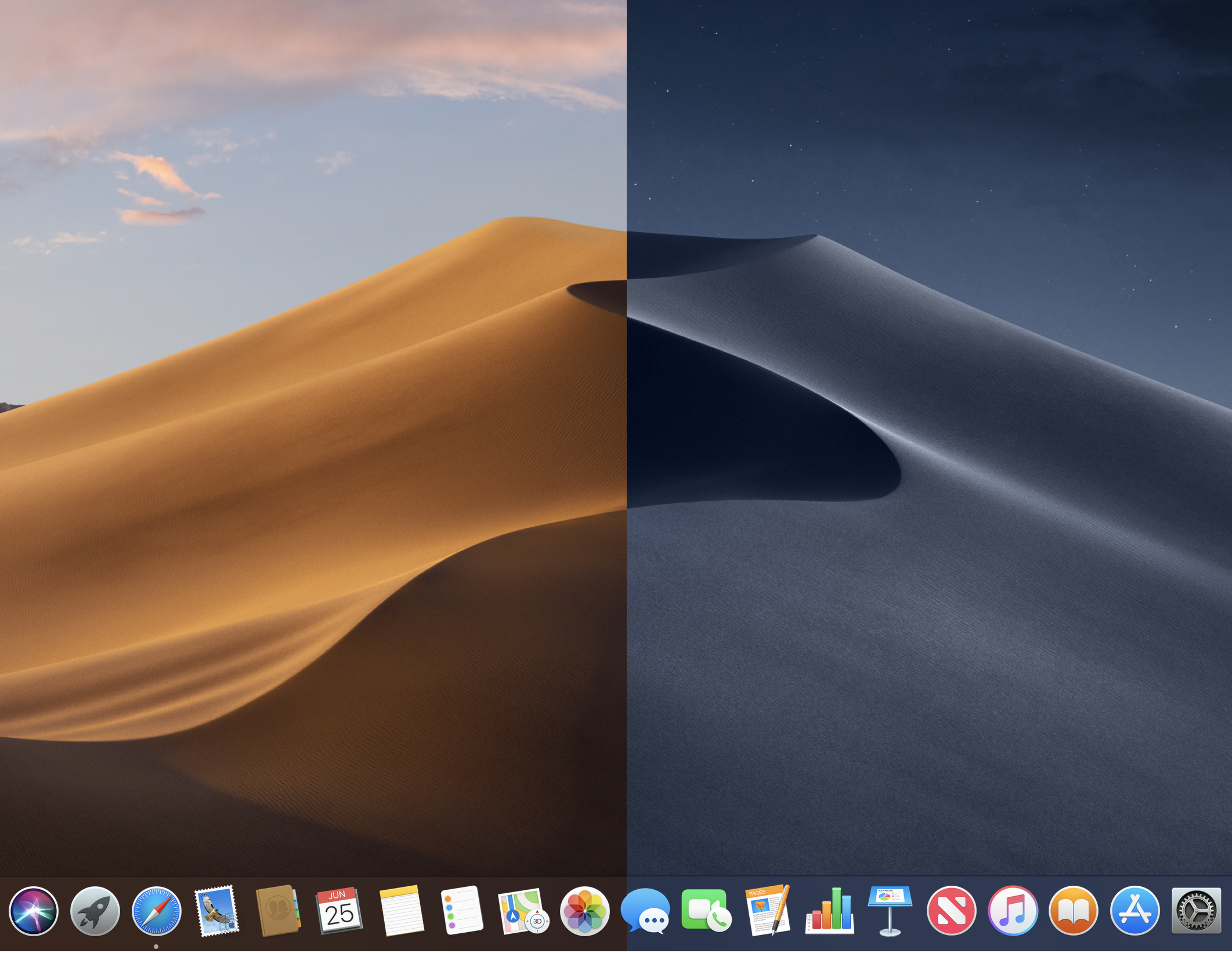
The biggest addition to Mojave is also one of the more interesting from a populist standpoint. Apple made it clear during its WWDC presentation earlier this month that Dark Mode is a hat tip to creative professions. It’s a category the company once owned outright, but one Microsoft has been aggressively gunning for in recent years with its Surface line.

Apple’s been knocked for a handful of decisions viewed as taking its eye off the ball for the small but loyal contingent that has formed its core user base. The company’s been making amends for this over the past year and change, with the addition of the iMac Pro and the promised return of the Mac Pro. Dark Mode is clearly a nod toward those who spend long stretches staring at bright screens in dark rooms.
Of course, it’s not just for creative pros. Dark Mode is a potential boon to all of us desk jockeys looking for some respite from eye strain. It’s also just aesthetically pleasing, and a nice visual break from a Mac desktop design that really hasn’t changed much in the past several generations.
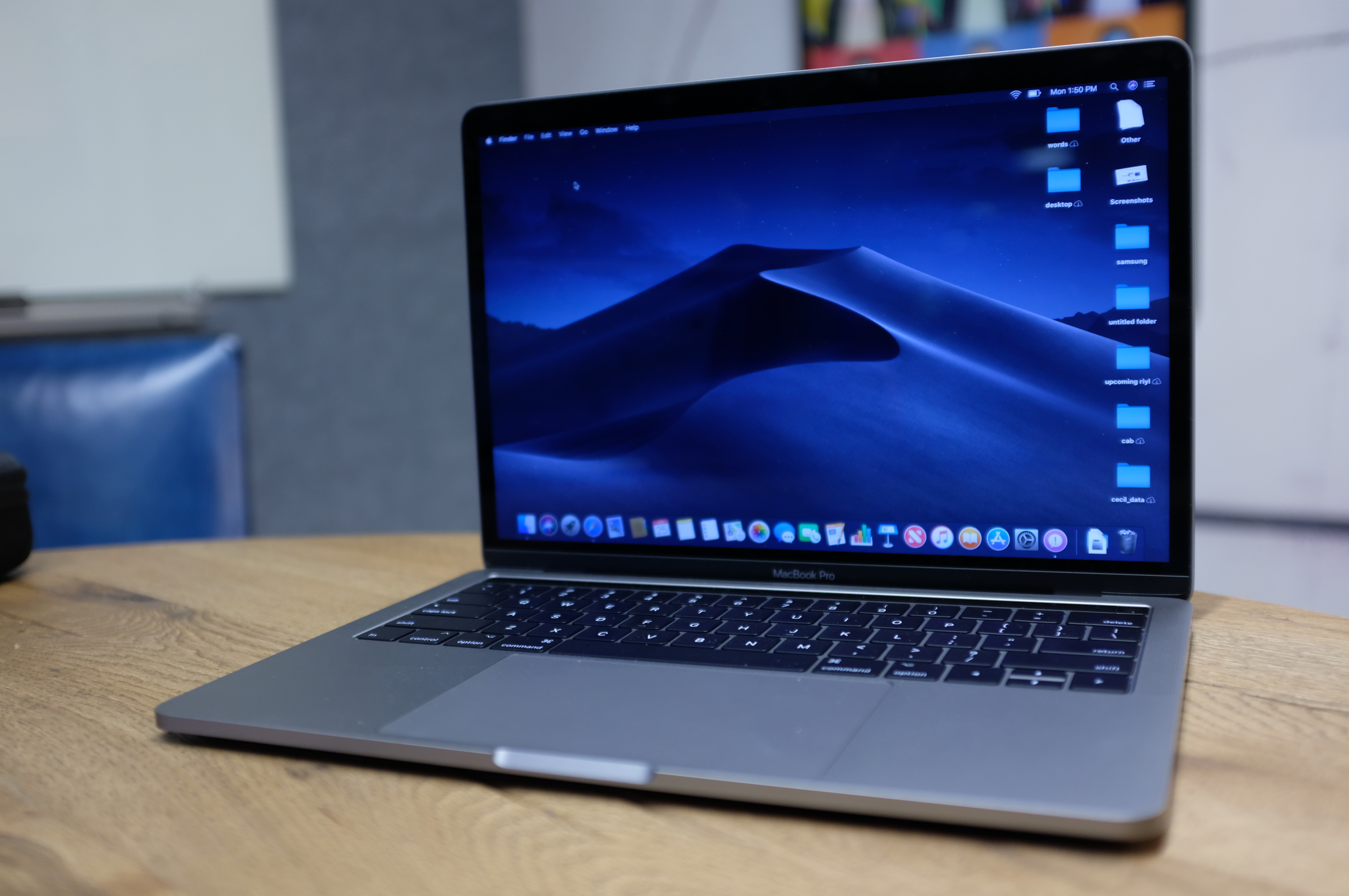
Apple’s done a good job here maintaining consistency across its own apps. Along with darkened menus and frames, Mail, Contacts and Calendar invert to white text on a dark background. The default Mojave desktop image of a winding sand dune has also been transformed accordingly.
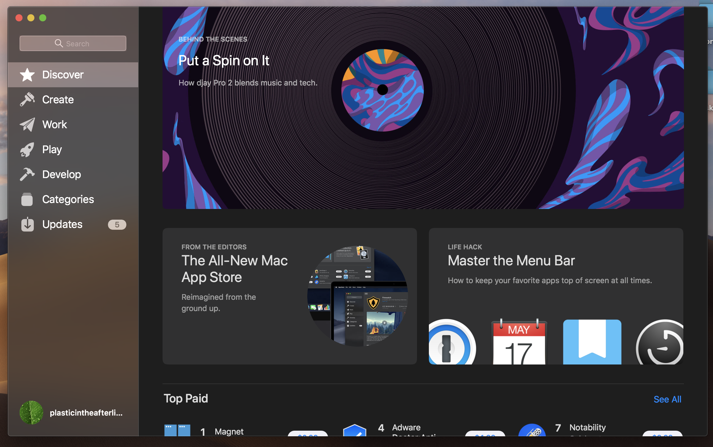
Better still, there’s a dynamic version of the wallpaper that will darken, based on the time of day, as the sun sets and stars come out in the desert sky. A nice touch. However, only the default wallpaper is capable of doing that at the moment. If you want the effect, I hope you don’t mind staring at sand.
The biggest issue with Dark Mode (in this admittedly still early public beta stage) is compatibility. Apple says that the mode is designed for easy adoption by third-party developers, assuming their apps are built for the macOS Mojave SDK, but there’s no guarantee the apps you use regularly will have that compatibility at launch. That means there’s a decent chance your dark desktop scheme will be regularly interrupted by a blast of white light.
This is also the case for Apple’s own apps like Safari (though iWork and other not preloaded Apple apps don’t yet have the functionality), which have implemented aspects of Dark Mode, but in which you’re going to be spending a lot of time looking at bright pages regardless. For most of us who spend time in and out of various apps, Dark Mode’s actual functionality is pretty limited, but you’ll no doubt be compelled give it a go anyway. At the very least, it’s a nice departure from the default macOS color scheme you’ve been ensconced in for so long.
Stacks
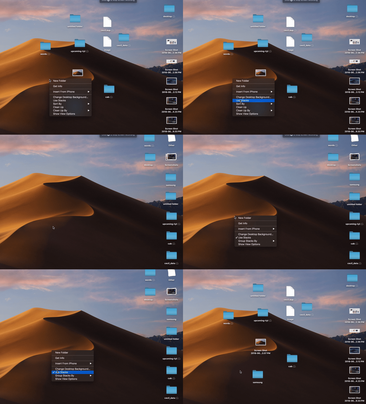
Dark Mode may be the feature that got the biggest crowd reaction at WWDC, but Stacks is the best. No question here, really, and this is coming from someone who’s gotten fairly consistent about tidying up his desktop. This thing is worthy of a clickbait-style “One Weird Trick to Organize Your Life” headline.
This is a surprisingly cathartic act. Hover over the wallpaper of your out of control desktop, two-finger tap the touchpad and select “Use Stacks” from the drop-down. Poof, they all shoot into their pre-ordained piles on the right. The default mode categorizes files by product type, which is probably the most straightforward method of the bunch (you also can switch to category or tag). If a file is the only one of its kind on the desktop, it will maintain its name below the thumbnail; otherwise, the file kind will show off below. Unclassified files will show up in a less helpful “other” Stack.
When new files are added to the desktop, they automatically appear in their associated pile, so long as you stay in Stacks mode. When the mode is enabled, files are essentially stuck to these spots like a grid. You can drag and drop them into apps, but can’t move them around the desktop.
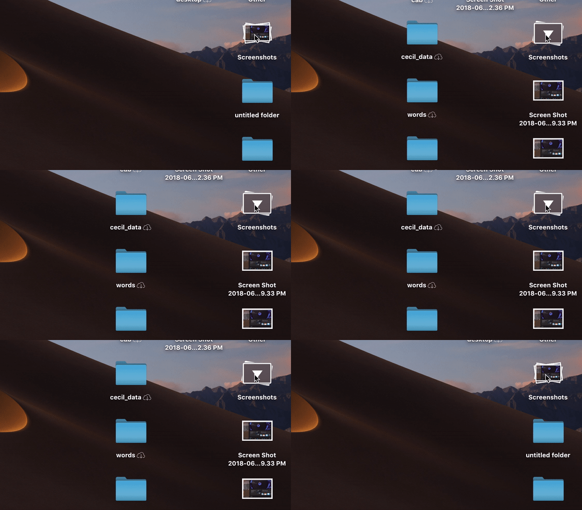
Once everything is sorted, clicking on the top of the stack will spread it out so you can once again view everything all once. Click the top of the pile again, and poof, everything goes back into the pile. You also can hover over the top with the cursor and swipe the trackpad left or right with two fingers to scrub through the list. I find the method a bit less useful, but some will no doubt prefer it.
If you decide the whole cleanliness thing isn’t for you, two-finger tap the wallpaper again. Click “Use Stacks” and poof, everything gets sent back to its original entropic position on the desktop. Good on Apple for letting users revert back to the madness.
Apple’s added a LOT of different features — from Launchpad to Tags — designed to help users get better organized. For my part, I’ve largely tried and failed to incorporate them into my daily usage. Stacks, on the other hand, is a genuinely useful addition and a strong contender for the most useful feature Apple has brought to macOS in recent memory.
Desktop
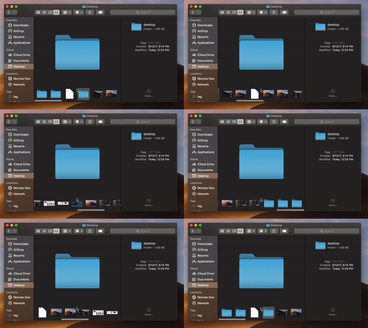
Gallery View is an interesting addition for similar reasons as Dark Mode. The feature is a spiritual successor to the familiar Cover Flow. It’s less dynamic, relying on a bottom scroll bar, rather than large images up top. It puts meta data front and center much more than before. This is especially apparent when dealing with images, giving you an almost light-room level of detail on photos.
The information includes, but is not limited to: dimensions, resolution, color space, color profile, device make, device model, aperture value, exposure time, focal length, ISO speed, flash, F number, metering mode and white balance. It’s lot for most users. In fact, it’s probably overkill for a majority of us, but it’s clearly another indication that Apple’s working to maintain its hold on the creative professional category by building that intense level of detail directly into the Finder.
Tucked down in the bottom-right corner of Finder windows are Quick Actions. There are a handful of handy features for editing images and PDF docs, including Rotate Left (as found in the iOS Photos app), markup (as found in Adobe Acrobat), Add Password and Create PDF, which turns files into PDFs, as advertised.
It’s an interesting system-level embrace of Adobe’s file format, and also makes the need for Preview somewhat redundant, as it’s baked directly into Finder. The options are dependent on file type — so, if you have, say, an audio or video file, you can trim it directly in the Finder window. For most tasks, you’ll probably want to open an editing app, but I would love to see more personalized actions down here. For my own needs, something like file cropping and resizing would be great to have built directly into the Finder window, saving me a trip to Photoshop or some online editing tool. I realize my needs aren’t the same as everyone’s — but all the more reason to offer some manner of customization down there, akin to what Apple offers with the MacBook Touch Bar.
Screenshots
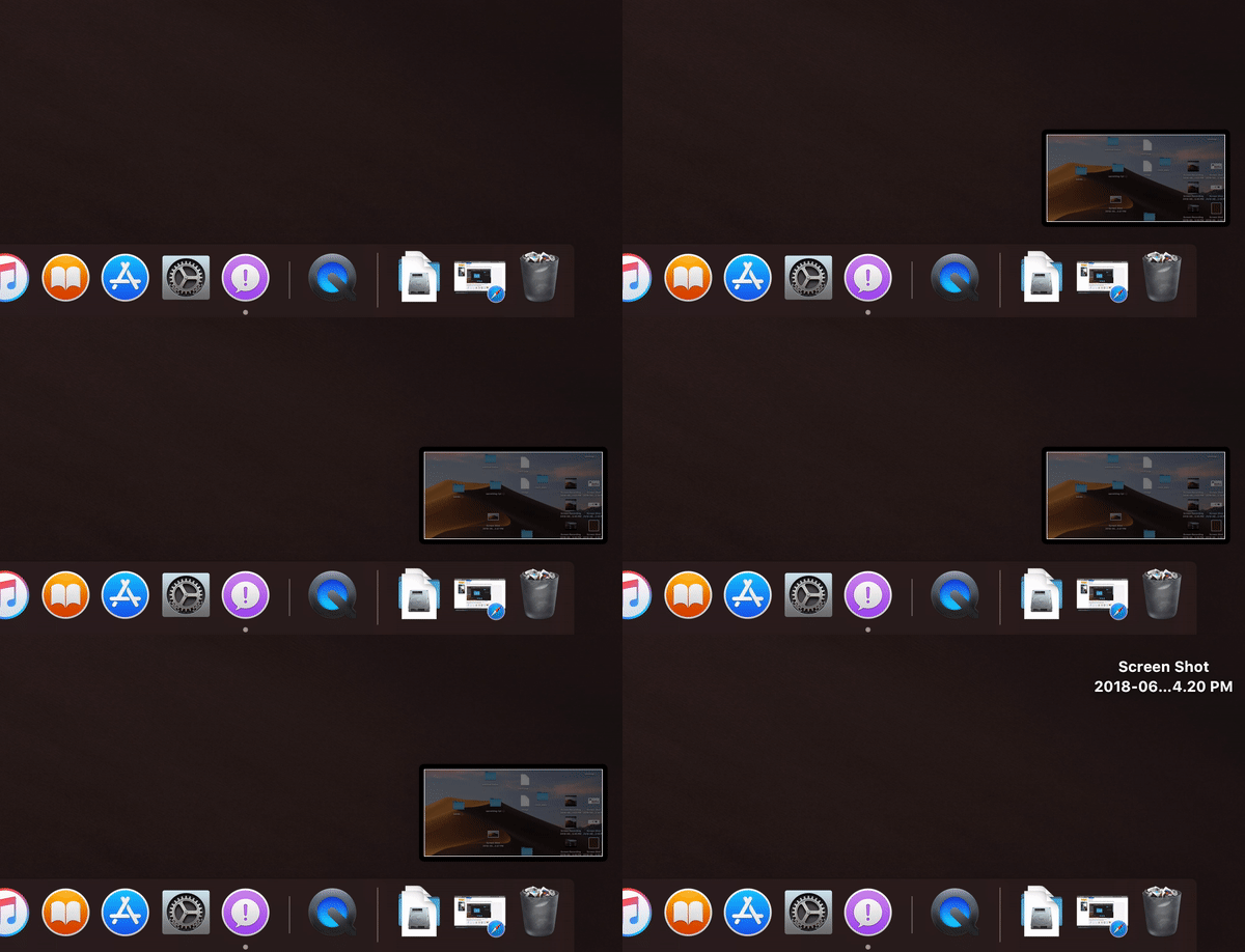
File previews are getting a lot of love here, throughout. I’m not sure how often normal people use screenshots, but I take them all the damn time, so any addition here is welcome. Beyond general usefulness, I suspect a lot of people simply don’t take screenshots because the key command is fairly convoluting. Shift-Command-5 isn’t exactly easier to remember than other, similar combinations, but it does bring up a hand control window overlay.
From there, you can choose to capture a full screen, a window, a selection you outline yourself, record a video of the entire screen (which I used for the above Stacks GIF) or record a video of a selection. It certainly saves from having to memorize all of the different commands. The new screenshots also make it possible to set a timer of five or 10 seconds before snapping a photo.
Apple’s taking a play from iOS, offering up a small window in the right-hand corner of the screen once the screenshot has been snapped. You can click directly into that, or just wait for it to disappear. From there, you can markup the file, drag and drop it it into a document or have it automatically sent to the desktop, documents, Mail, Messages, Preview or a Clipboard, so they don’t all wind up in the same spot.
Continuity Camera
Not sure how often this feature will actually prove handy for most users, but it’s a cool feature, nonetheless. Continuity Camera essentially uses an iPhone as a surrogate camera for the desktop. It’s a clever bit of cross device synergy.
Say you’re in Page. Go to Edit > Insert from Your iPhone and choose Photo. Take a shot, approve it on the device, and it will automatically insert itself in the doc. It works like a charm. The scan feature also works surprisingly well here. I took a shot of a crumpled receipt and it looked pretty pristine, regardless. As someone who recently went through a lengthy visa process, I wish I’d had access to this thing a few weeks back.
FaceTime
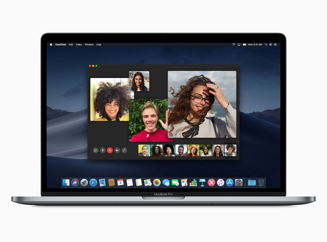
This one definitely wowed the crowd. FaceTime’s macOS/iOS-only is the main thing that’s hampered my own use of the service, but there are some really nice additions here that are making me rethink the decision. The ability to add up to 32 users is far and away the most fascinating, and Apple’s done a good job managing that kind of unruly number.
Similar to services like Google Meet, the system automatically detects who’s speaking and places them front and center in the app. Also like Meet, you can manually prioritize the users on whom you’d like to focus.
Other users will shrink down and eventually populate the carousel at the bottom. You can get the list of participants by clicking the Info button. And invitations for more users can be extended while the chat is in progress.
iOS apps
Apple made a point of addressing longtime rumors of a convergence between the company’s desktop and mobile operating systems, flashing a giant “No” onstage. That said, the two OSes are getting even more shared DNA. The biggest news on this front is the porting of three iOS apps to the Mac. This is clearly the first step toward a larger convergence of some kind, but more to the point, it’s a way to start getting app developers to port their iOS apps to the desktop.
Sure, macOS had a huge head start, but iOS has been getting all of the developer love in recent years. Making it easier to create apps cross-system means devs don’t have to decide. It also means that the app that come to macOS through this method will be more likely to do so through the Mac App Store — a distribution method Apple clearly prefers over more traditional downloads, for myriad reasons.
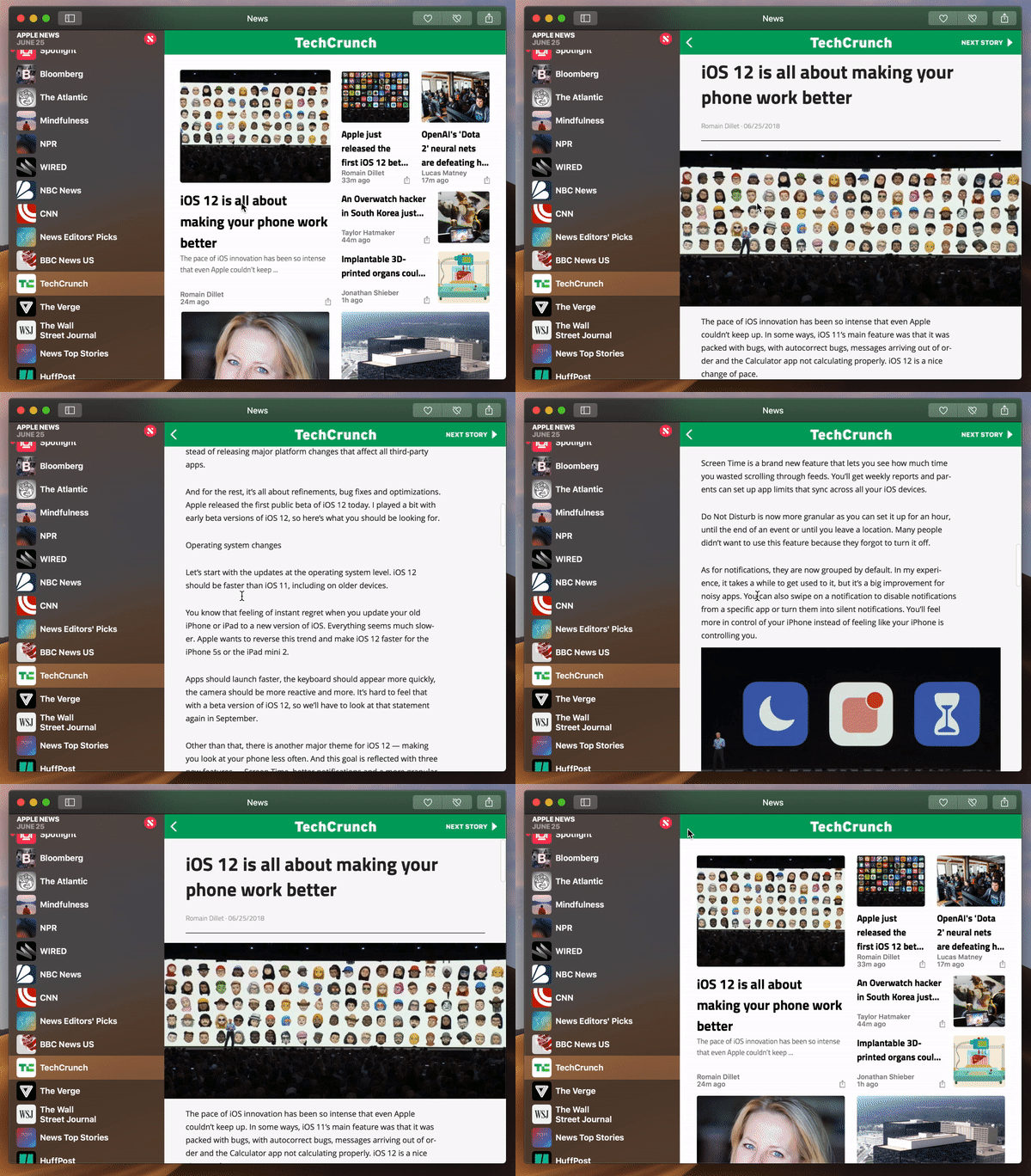
To start, Apple has brought over News, Stocks, Voice Memos and Home. In my time with Mojave thus far, News is the one I now use pretty regularly. I was a bit hesitant to move to a more walled approach to news delivery, but I do appreciate having a centralize hub of the trusted news sources I visit regularly, coupled with alerts that populate the Notification Center at right.
It’s probably not going to replace my use of TweetDeck for work-related news, as, among other things, it just seems to update more slowly. But it’s a nice tool to have churning in the background, along with a check-in once or twice a day, to make sure I haven’t missed a moment of the horror show that is news in 2018. Fun!
Voice Memos probably has the most limited scope of the bunch. I’ve switched over from various third-party tools I use to record meetings from time to time, and it’s nice having that sharing across devices. Students will likely find it handy for lectures as well, but beyond that, it’s probably not going to get a ton of play for most users.
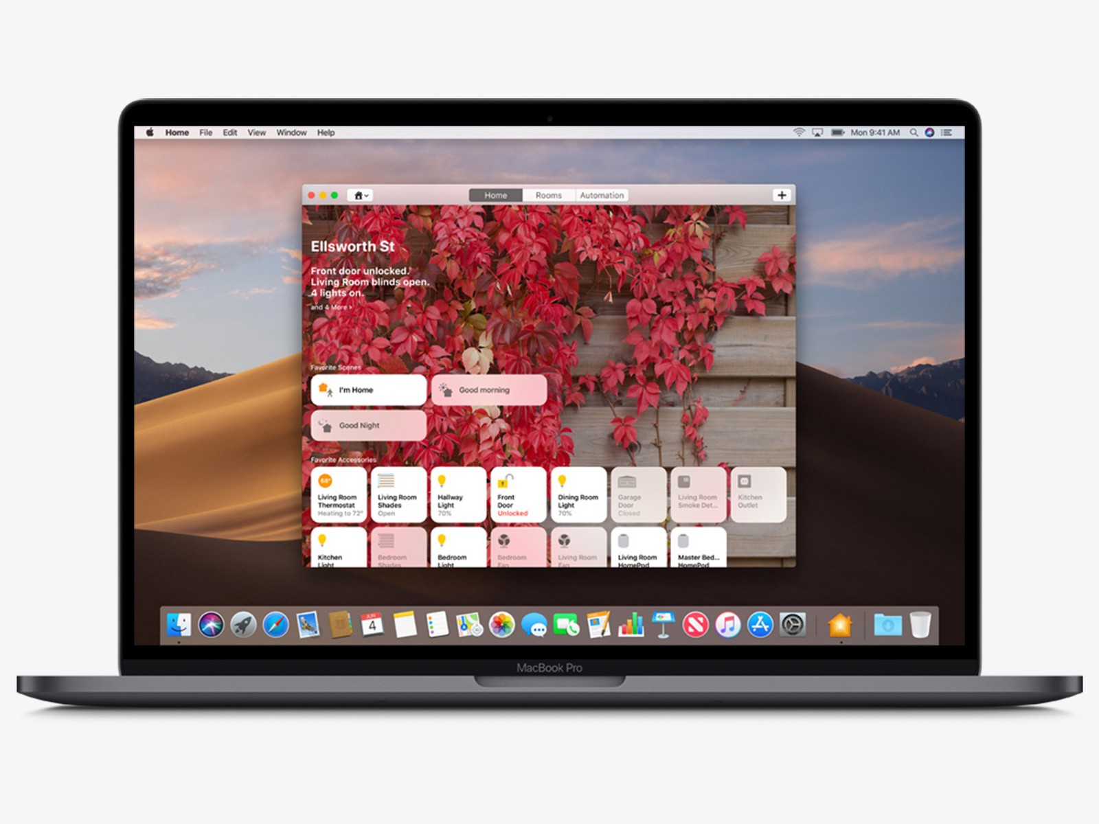
Home is the most interesting addition of the bunch. Certainly it makes sense, as Apple makes a bigger push to remain competitive against the likes of Amazon and Google in the smart home. The Mac isn’t designed to be a hub in this case — that’s still the job of Apple TV and HomePod, so far as the company is concerned. But the desktop OS does make for a nice control panel, and it’s handy to be able to check in on your place remotely from the comfort of your MacBook.
Given that they are, in fact, ports, not much has changed from a design standpoint. That means it’s essentially the same layout as the one you’ll get on your iPad, with a grid of tidy little boxes representing your various connected home devices. It’s pretty hard to shake the compulsion to reach out and touch the things. Apple, of course, has taken a hard-line against incorporating touch into its laptops and desktops, so reaching out won’t get you very far in this particular case.
Odds and ends
- The Mac App Store gets an overhaul here, including search filtering and new content categories. Apple’s also added the kind of editorial curation it’s had on iOS and other apps.
- More privacy permissions is always a good thing. In addition to the standard access to Contacts, Calendar Photos and Reminders, Apple’s added notifications for apps accessing the camera, mic and sensitive data. That means more pop-ups to click through, but more importantly, some extra peace of mind.
- The system now does “password auditing,” to make sure you don’t reuse the same passwords over and over again.
- Siri gets a couple of additions on the desktop here, including the ability to add passwords with voice.
from Apple – TechCrunch https://ift.tt/2MrDT1Y
Comments
Post a Comment